
Animation can be a great addition for branding due to its unique ability to enhance the identity of the brand, its capacity to engage with audiences, as well as to communicate messages clearly.
Think of movement - it always draws more attention to our human eyes. Motion design attracts and holds the viewer's attention more than any static image or text. When you develop your branding, you choose a font, color palette and shapes - all of which would then speak to your audience. Well, animation does that too - with more efficiency.
Motion design brings brands to life.
By adding movement and visual storytelling to the elements such as logos, typography, and color schemes, animation has the power to evoke emotions, creating a deeper connection with the audience.
Engaging animations in marketing materials, social media posts and website elements can create a more immersive and memorable experience for the user, leading to increased engagement with the brand.
Motion will allow for the consistent application of branding elements across various platforms and marketing channels.
By using animation in the brand's identity, businesses can maintain a cohesive look and feel in 360º communication channels, reinforcing brand recognition.
Overall, motion design will add depth and elevate branding and design identity. By incorporating motion elements that align with the brand's values and personality, brands can convey their message in a more emotionally impactful way, promoting brand loyalty and affinity.
Motion design provides an excellent medium for storytelling.
Brands can use animated videos or motion graphics to narrate their brand story, showcasing product features, or explaining complex concepts in an appealing and accessible manner. This approach helps in delivering brand messages more effectively and making them catchy and shareable.
Let’s get more personal here.
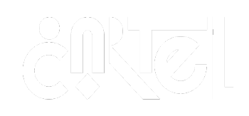
For CARTEL’s branding, we decided to go black and white. Why? Most of our work is colorful and somewhat playful. We thought if we added more colors we couldn’t go too bold on either forms or animation. Something had to give, so we decided for a total B&W approach.

We wanted our logo to show what the studio was all about!
We had the pleasure of working with an amazing graphic designer (Marcelo) and he came up with a concept we loved - since CARTEL is a combination of different people with various skills, it reminded him of playing cards. He then translated the typical suits to graphic elements and incorporated them in our branding.
The first version of the logo we got was bold but still very… tight. We told the designer to redo the logo but after having a few drinks, while listening to some samba & pagode (very uplifting Brazilian music) - and that’s how our logo was born!
Then it was the fun part for us: animating the logo. We choose a very fun, playful way to animate, using the graphic forms as secondary animation and animating each letter with a different animation.
We think of ourselves as nice and approachable and fun to work with, so we wanted to translate that to our studio branding. Of course we understand this might not be the path for every business, but as an animation studio it was important for us to push the animation to the edge as well as to show what we are about.
And how do you make your brand’s motion stand out?
Nailing the nuances. Focusing on the smaller details and fine tuning what most people won’t even notice. These subtle choices will shape the character of your motion and consequently, your branding.
For that, you should spend time defining how you work with motion. It’s also important to have some time for R&D (research and development). This will allow the motion design studio to find creative solutions that might not be so obvious at first sight, and it will help your brand stand out with clarity as well as to shape your brand’s personality.
A Modular approach.
Also important to notice that a modular, systematic approach could work. That way the studio can develop multiple animations based on the animating parameters - for example just working with opacity, then working just position and after combining them both. This systematic approach will lead you to new ideas and at the same time you can discard what you don’t like (and come to the conclusion why certain animation doesn’t fit).
Like to find out more? Feel free to contact us at hello@wearecartel.co
About the author: CARTEL is a motion design studio. A collection of bold creatives with diverse backgrounds that combine all the elements of design + animation under one name.